Part I
Outline
Summary
I want this project to communicate these messages: unionization has a long history of being beneficial for workers, the practice is and has been under attack, there is hope for the future, and that we can create a future that prioritizes workers, not profits. The history of unionization in the United States is interesting context for this project, with emphasis on landmark legislation and Supreme Court cases for the labor movement. The long-term opponents of unions should also be introduced in this project, in particular, Right-to-Work legislation and its effects should be explored. The fall of unionization rates, its political causes and effect on workers, will be an important highlight. The modern boost in popularity of labor unions, along with recent labor wins, will end the presentation on a hopeful note.
Structure
The project will begin with an understanding of the origions of modern labor unions. This will begin with a discussion of working conditions and averages wages in the U.S. before labor unions. The rise of labor unions will then lead into how they were attacked in the 1950’s-1980’s, specifically honing in on Right-to-Work legislation. This is meant to emphasize how labor unions are good for workers, and how the revocation of union power hurt the working class. When people are sufficiently missing the power of union representation, I will transistion into the modern union movement, how its gained some power, and how we can all move forward to create a world with more dignity and respect for workers. Specifically, I will point out to this crowd of graduate students that they should seek out unionized workplaces.
Initial Sketches
Union Benefits
I first want to show the benefits of unionization on a variety of quality-of-life aspects. Healthcare is a great example of this. I made this visualization below for a project in my Data Analytics with Tableau course last mini to show the difference between union and non-union workers’ access to different types of healthcare, and I would be interested in amending it for this project.
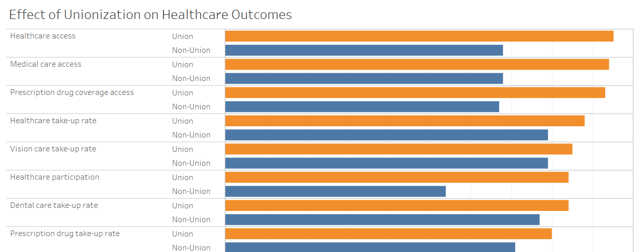
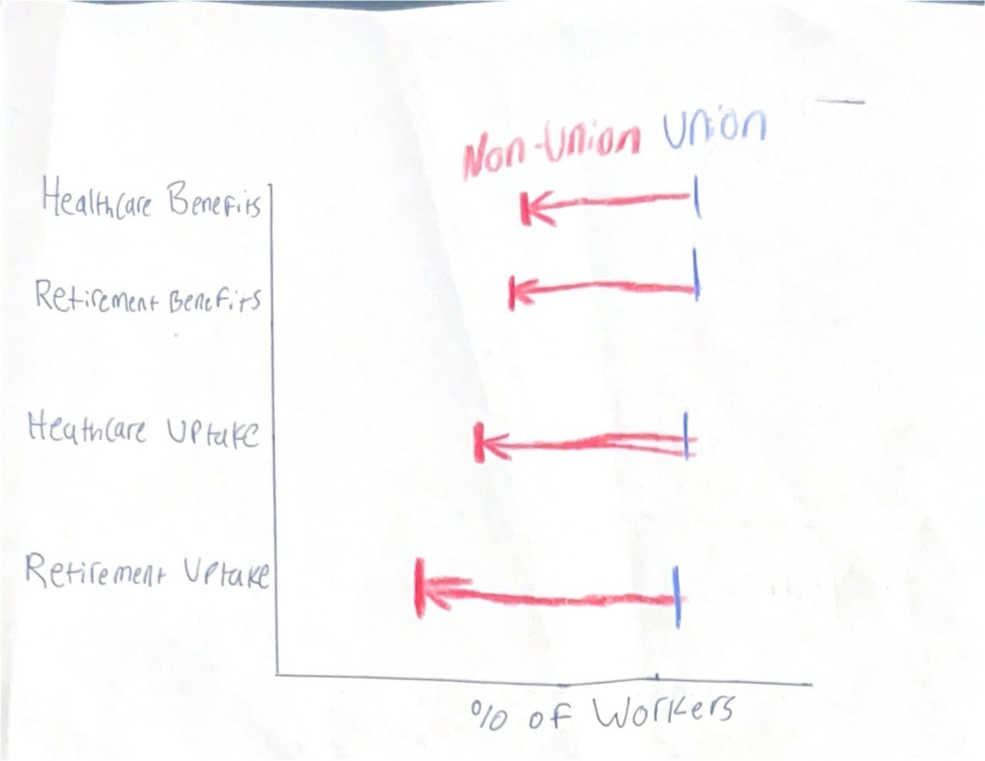
I generally like this graph, I think it’s overall effective, but I want to expand on this concept with a more aesthetically pleasing design. My first general idea is to synthesize the two bars for union and non-union into one bar, highlighting the difference between the two groups. Below is the first version of this new idea communicating the same information.
Unionization Rates
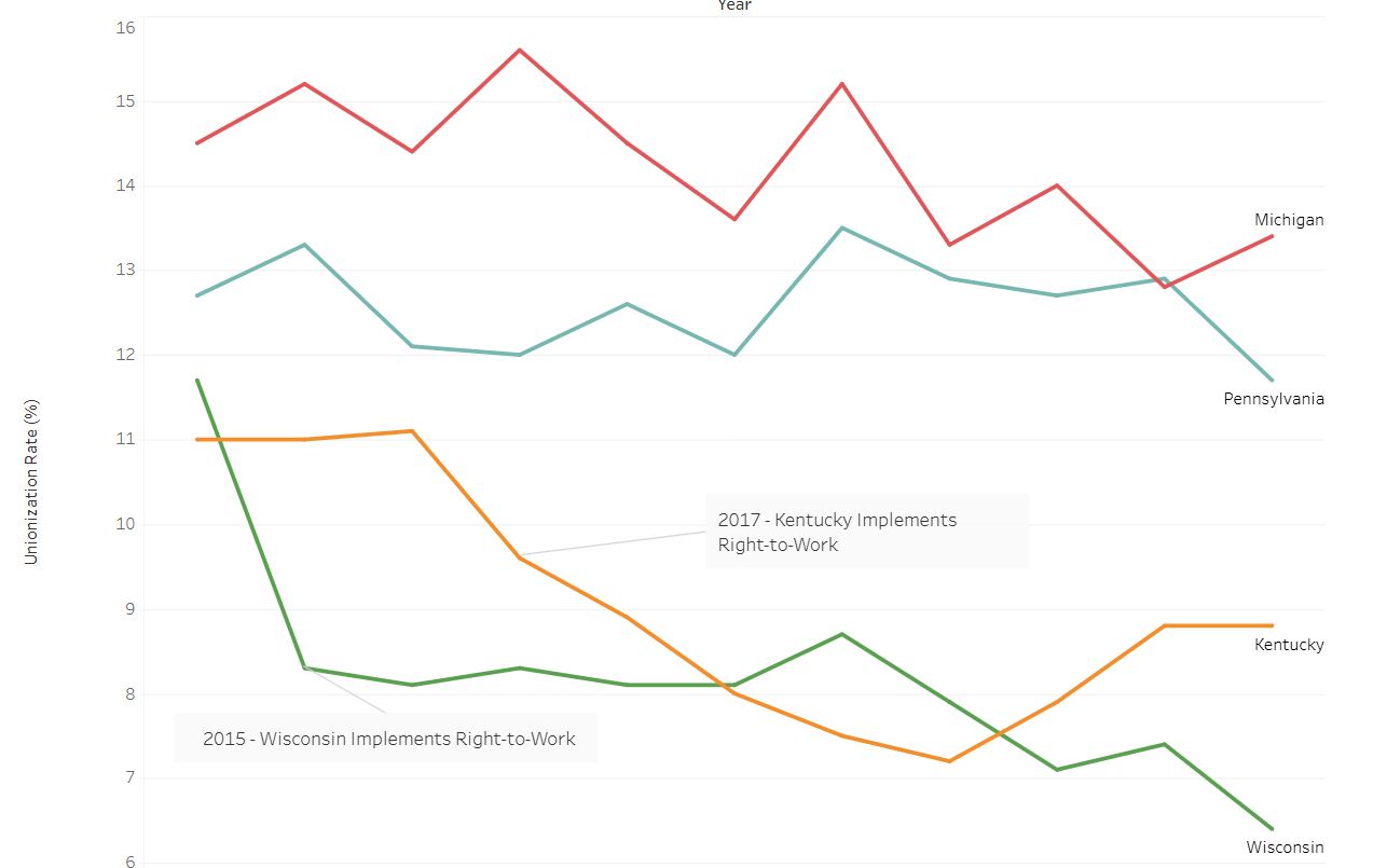
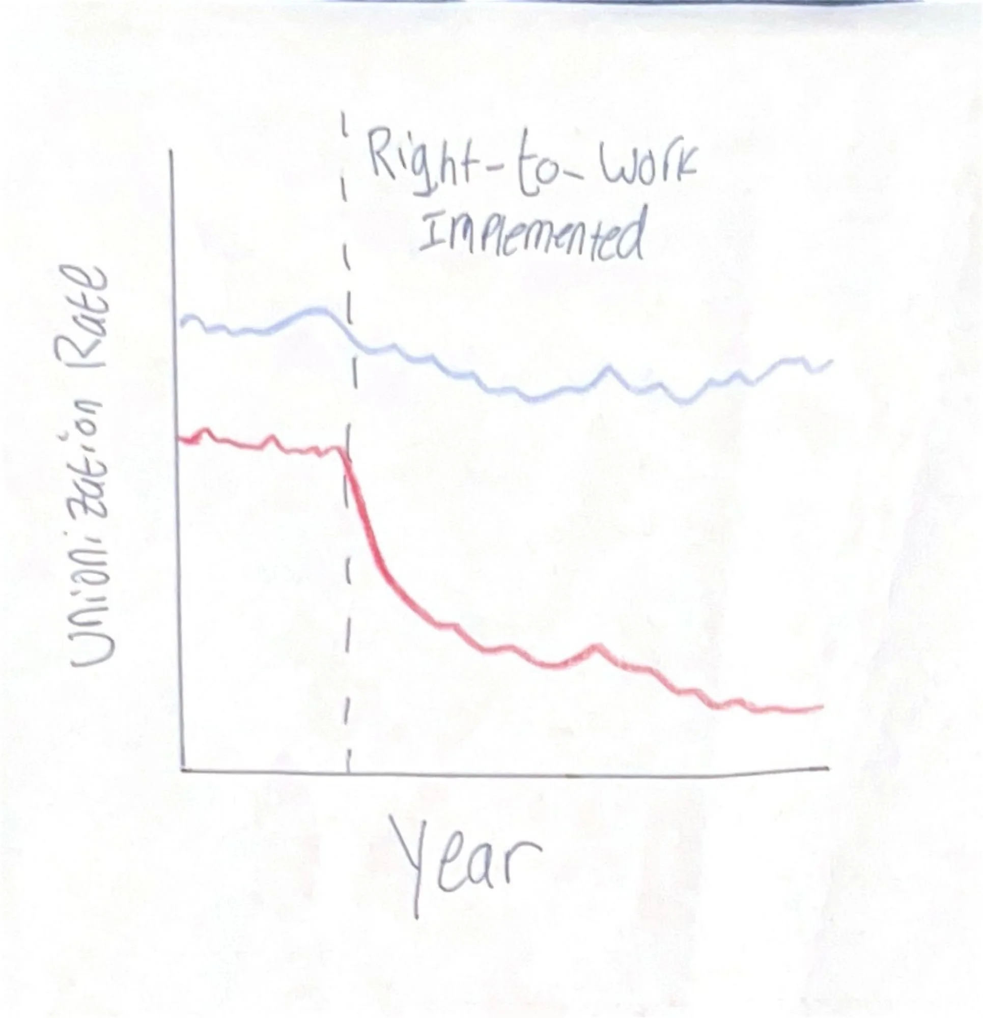
I also made a visualization for the same presentation to see the effect of Right-to-Work legislation on unionization rates. I kept this visualization to four states, since the project was to compare two Right-to-Work (RTW) and two non Right-to-Work (Non-RTW) states, but I would want it to simultaneously expand and narrow this idea with two visualizations in this project. Below is the original viz.
My first idea to reimagine this graph is to expand from four states to all 50. These would be differentiated by color to denote RTW and Non-RTW, in an attempt to show how these laws result in a comparative loss in unionization rates.
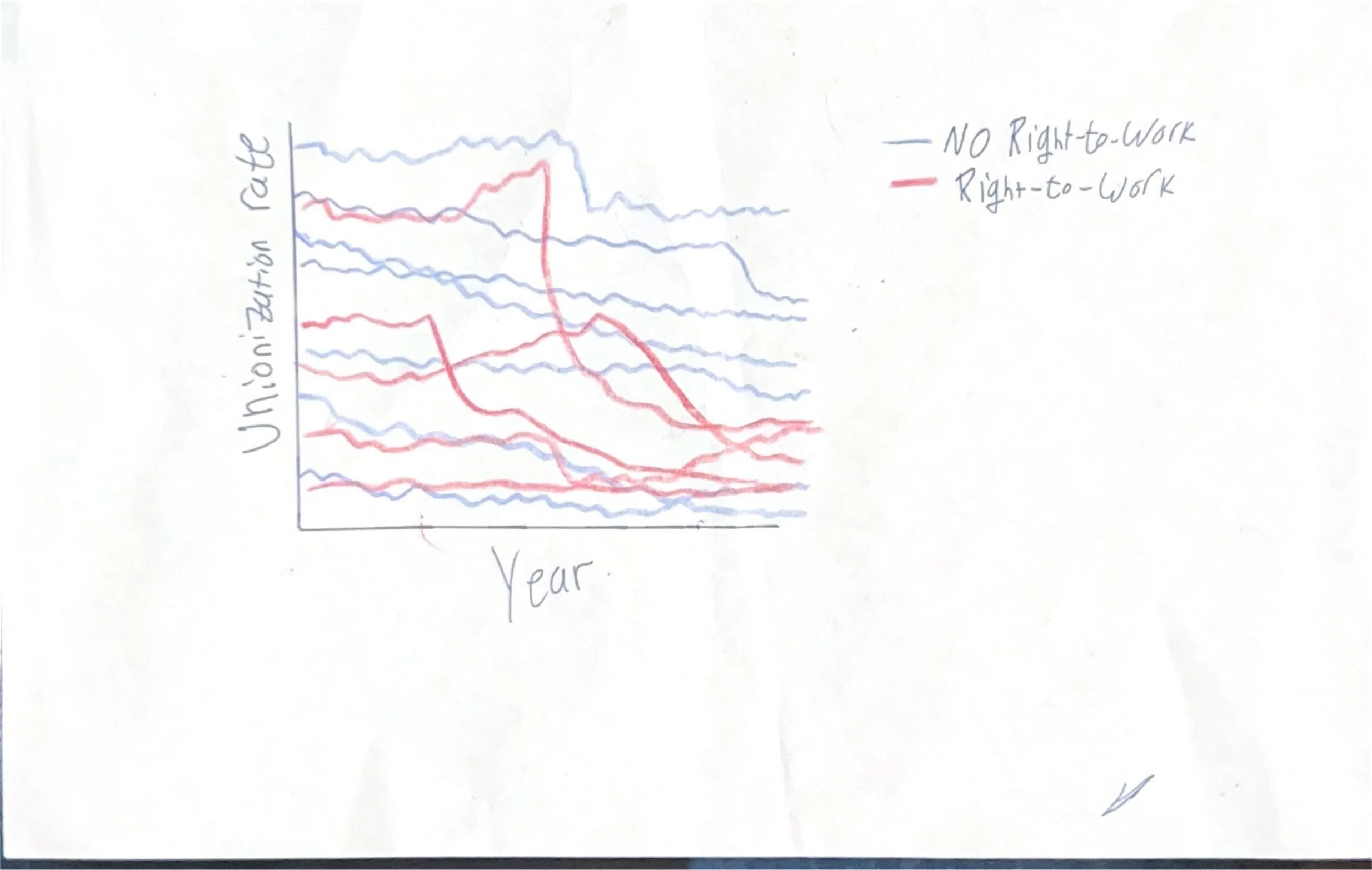
To also narrow the scope, I will take two states, in similar places, with similar starting rates, to get a case-study level of the effects of Right-to-Work.
Data
BLS
The Bureau of Labor Statistics has yearly unionization rates for each state, going back decades, as well as information of benefits for unionized versus non-unionized workers, and the general differences in wages. An example for 2025 can be found here. They also have the data for differences in union vs non-union access to healthcare and retirement benefits, found here. The weekly wage difference between the two groups is also produces by BLS, and can be found here.
Method and Medium
Tableau
I will mainly use Tableau to produce the visualizations for this project. The versatility of the program will be helpful in producing many different data visualizations, such as bar, line, and bullet charts, with relative ease.
Shorthand
To turn this list of visualizations into a cohesive format, I will use Shorthand. The platform will create a cohesive story between each visualization.